

Bad tech design trends
An underappreciated amount of industrial design goes into every product you buy. Every part, every curve has a lot of thought put into it. However, that doesn’t mean that all designs are necessarily good. Some are just downright awful, and fail to click in the marketplace. However, occasionally a bad design will creep its way into the mainstream, with tech certainly being no exception. Here’s four bad tech design trends we just don’t get.
Overly bright status LEDs
Most electronic devices have some sort of status LED. These really just exists to tell you the device is plugged in and getting power. Which, is also readily apparent if you, I don’t know, try turning it on. One particularly bad design trend though, which has been going on well over a decade now, is using comically bright LEDs for this purpose. Take the Surface Pro for example. The one on its proprietary charger is a stark white that’s literally bright enough to serve as a night light. Especially if the little end cap falls off, which it inevitably will. Bringing to bare the full eye blinding brightness. The thing is that Windows, like most operating systems, has a system tray icon that tells you if you’re device is plugged in and charging. So the LED is completely unnecessary.
Why this is a particular problem in my case is due to where I primarily use, and charge, my tablet. That being my bedroom. Which isn’t great for someone who needs a dark room to sleep properly. I also recently bought a Chromecast with Google TV, that has the same bright white LED in it. The TV itself, has a bright red one. None of which you can turn off in the settings. So basically every gadget in my bedroom has them covered up with bits of black electrical tape. Why do they have to be so bright? There’s no reason for it.
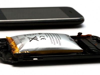
Cables with no strain relief
When designing a cable, it’s important to build in some kind of strain relief. This helps prevent internal connections from becoming damaged through regular wear and tear. Something which is especially important for portable devices that will regularly get plugged, unplugged, shoved in a bag, wrapped up, or stuck awkwardly on a shelf or table. Yet so many of these cables don’t even bother with strain relief anymore, which is a bit of a problem.
Now, we have Apple to thank for this once. When designing their USB cables for the iPod, they wanted something nice and sleek. So they did without chunky strain relief wire guides, and just put a little collar around the tips at the connection ends. Along with a very thin layer of insulation, these cables were incredibly prone to fraying and breaking. Something which the company has never truly rectified. Meaning you have to keep buying new cables periodically to replace ones that wear out for no good reason other than looks.
This isn’t such a big deal with iPod cables. It’s wasteful, sure, but they’re cheap enough to replace. But then they started doing it with their laptop chargers. The ones where the cable itself is permanently attached to the charging brick. Then other companies followed suit. Like Microsoft. I’m now on my third power brick for my Surface Pro. The first party one lasted a while before it gave up the ghost. Now the third party one I bought earlier in the year has already worn out. The device charges intermittently and requires a bit of cable contortion to get it going. I don’t abuse it, but the design of the magnetic plug they use has the cable bend at an awkward angle when you prop it up on a table. This is an utterly terrible design. A classic case of needlessly putting form over function.
The notch / hole punch
Everyone hates bezels. Those ugly black borders around your display. They’re so big and chunky. So what if we just shrank them so the screen goes right to the edges? Looks great, doesn’t it. Well, except for one glaring problem. What to do with the front facing camera? You can’t just get rid of it, or else how would you take obnoxious Instagram selfies? So the solution was simple: just put a hole in the middle of the screen.
Apple’s iPhone X was the first to come with the so called “notch” way back in 2017. So why the display didn’t have any bezels, it actually kinda did. See, this is what the experts call having ones cake and eating it too. At least they did it in a bit of an elegant way, by using the little bits of screen on either side of the notch for the time and battery icons. Though it still gave the screen an overall lopsided feeling to it. Especially for widescreen video content was concerned. So Android handset makers took a different route. No bezels, no notches. Just a gaping black hole at the top centre of your screen. Which most internet pundits call the “hole punch”, but I’m dubbing it as the “camera goatse”.
The problem is that neither really makes your screen true edge to edge, as you can’t really put anything useful where the notch / hole is. It really strikes be as a bodged solution to a manufactured problem. Some handset makers are now doing fully under display cameras. Which sort of work, but the top and bottom bezels were just better all around.
Folding phones
Wouldn’t it be great if your phone could fold out into a tablet? So now instead of two devices that do one job well, you now have one device that does two jobs poorly.
Now, the concept of having a dual screen display isn’t a horrible idea. Nintendo did it for years. Microsoft’s Surface Duo is also a neat concept, if not grossly overpriced for what it is. Now, we’re talking about those phones like the Galaxy Z, which use a flexible OLED screen instead of traditional solid glass ones. It’s one of those ideas that sounds great on paper, but doesn’t quite work in execution.
See, one of the advantages of OLEDs is they can be printed on flexible plastics. Which is what enables the screen to fold in half like a taco. Problem is, the displays will inevitably develop a crease, much like your dress shirt that you gingerly laid on the back of a chair. Fans claim they don’t notice it a while. Just like I pretend I don’t notice my shirt isn’t ironed. Second generation models have improved the technology far beyond its first iteration. They don’t quite break or scratch as easily as they used to. Although both are still a problem. But the crease is still there in all its ugly glory, right down the middle of your display. Like the notch, it’s yet another example of phone manufacturers trying to solve a problem that didn’t need solving.